 |
| (Image used for the front cover) |
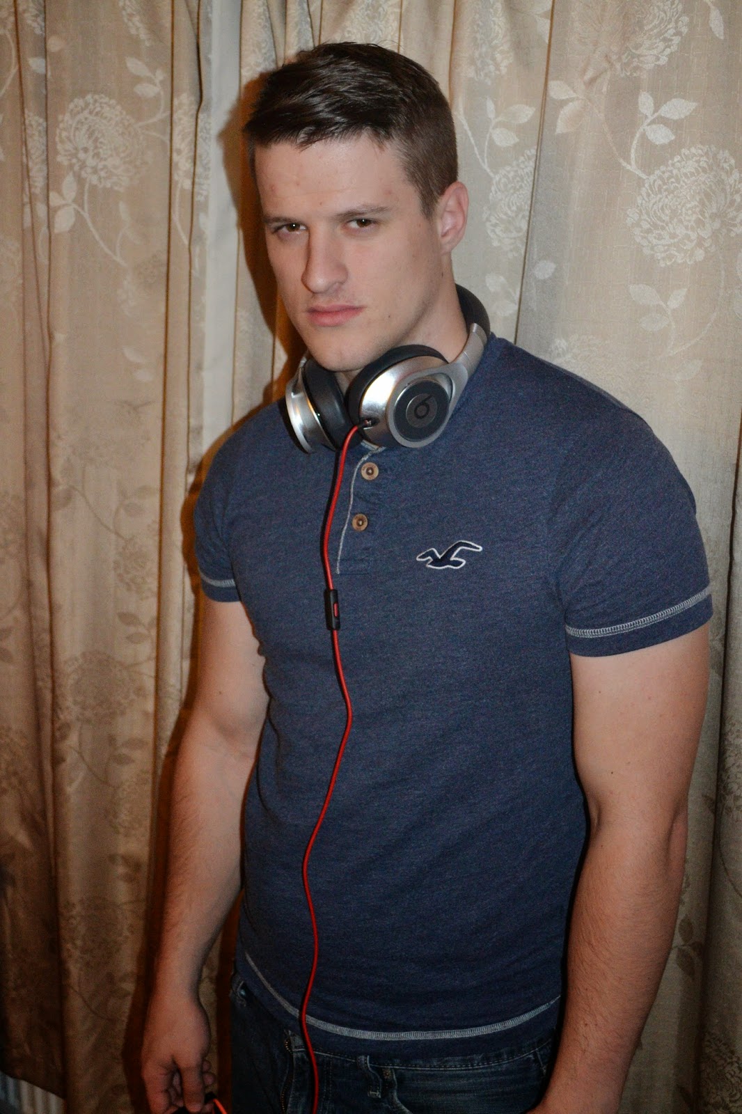
All of these images represent my target audience and the genre of the magazine. Most of the electronic dance music magazines have just a guy (or a girl) on the front cover with no musical props or anything, more looking like a model. That is why I have chosen the man (attracting females audience, also much more Dj's are males which is a connotation of my genre as well).
This photo shot was made in pretty bad lightning, home environment and it does not look as professional as I want it to look. Always tried to used mid close-up or a close-up for my images.
I have decided that these images are not suitable for my real magazine front cover, but it is a good lesson for me. I also will use some of them on my double page spread and my contents page. Especially images where the character is smoking is a connotation of the electronic dance music.
The best example of this is the article about well known electronic music dj written on 'Mixmag' online site :
The image they used is a very strong connotation of the dark side of the music, as the image is dark and the smokes in the background, you can see that the character is wearing headphones to connote about the music (that is why I used headphones in my photo shot) but it is clear that an image like that cannot be used on the front cover.
I wanted my front cover to be pretty dark but have like a fading effect from black(or dark blue) to white. (Just like an image on the website above). So I cut my character out of the original image and put him on the background.
It looked like this :
Then I designed the masthead myself (drew it) and tried to put it on the image. My original masthead looked like this :
It should not be black and white, and the lines are not perfectly straight but I just wanted a rough idea how it would look. It will be corrected for sure. The line underneath has to be much longer to go through the whole image as well. I have chosen to make the masthead myself because I had my own idea and online sites are quite limited when I know exactly what I want.
So even though my image was not perfectly corrected at the time, I put the masthead on it, to have a rough idea how does it look.
Now when I see how it looks, I know I do not like the way image looks so unreal and not 'in depth'. You can clearly see that it is just put on the image, it does not look real, also the arm which goes in inside the image looks like it is not cut properly. The blue shirt and the blue background is not the best idea either. The character blends in and the only thing that catches our eyes is the red lead which goes from the earphones. Also we cannot see character's hands, it looks unreal.
So I decided to re-do my photo shot. This time using the studio to create the real fading background working with lights and constantly changing my character's pose to find the best one and the most applicable for my type of music magazine.
I will try to experiment with my background making two different ones : very dark one with model wearing something very light and then the opposite, white background bleaching to light grey and model wearing black clothes.
Serious face is a 'MUST' thing for my magazine front cover as well. The only one 'prop' will be used is headphones or a computer (computer will not be seen on the front cover).


No comments:
Post a Comment