Showing posts with label Feedback. Show all posts

Saturday, December 13, 2014

Focus Group Analysis


In order to find out more about my Target Audience, to find out what are their opinions about my media product I did a focus group.
I used three girls quite the same age rage, making sure they could be a part of my target audience. (in other words I made sure they are representative sample taken out of the whole Target Audience Population.

The first question I asked all of them was 'What do you like doing in your free time?'
Just to make sure they all enjoy quite the same things and also to make sure they have what to talk about to start with. (This gave me the opportunity to make the impression of 'friend to friend' chat) The answers I got was going to gigs or festivals, hanging out with friends, listening to music, having 'active' lifestyle. Which proved that my sample is representative as it matches my T.A profile hobbies. 

Then I showed them my front cover image : 


And asked them to identify genre of the magazine and to tell me what makes them believe it.
All three my respondents identified genre correctly, they said they can see it through the colours used also the masthead, writing and the main character (headphones, attractiveness, etc)
Focus group was very happy about the grey font colour instead of white. They said 'White became boring, on every single magazine front cover whereas grey looks more playful, more dragging attention. The same with the use of dark blue colour font. Very rarely you see the magazine which uses the dark blue font. But it is well-played as it matches the main character's shirt.'

Also focus group participants said that most of the topics on the front cover works well for electronic dance music magazine. Unique masthead which is behind main character's head, which means all the attention is allocated at the main character.


Afterwards I showed my focus group a picture of my contents page (still a draft version)


The biggest concern from focus group when it comes to my contents page was about using words and number ON the pictures, instead of next to it, but I was recommended earlier to move it on images as it is hard to understand which image goes with which text bit.

Focus group liked the use of colours as they said it matches the front cover.
I asked 'Can you tell me if this is the same magazine and why?'
Mostly mentioned answers were use of colour, use of font, the same character, the same name of the magazine (at the bottom)

The third bit I showed was my double page spread :
(left side)

(right side)
I am worried about the light blue quote in the middle of the text, as the text does not wrap around (if it does - it just looks not right, the whole text stretched out through lines. So I asked my focus group opinions about it.

'This version of the quote in the middle doesn't look bad, it just looks a bit untidy. I would prefer to see more black from the right side of the quote' said one of the focus group members.

That was the most important question for me. The other questions was about questions and how well does that stand out of the whole text, is it not the 'anti-modern' way to drag attention to the text using underline tool. 
Girls were positive about using this tool they said it worked very well knowing the whole genre of the magazine. 


All the students used were non-media students which made sure they are not looking for 'conventions' or anything that media students would pay attention at first. Also all the work was shown digitally which made sure my participants do not have to look at two separate pages stretched out like now on this blog, they've seen the actual way it looks. Also I had couple of drafts on paper, but that was old drafts just for comparison between my old 'dps' and the current one to see my participants opinions about it. 
Overall I got the idea that I am doing the right thing as anything that my participants had to compare seemed that the they liked the new work much more than the old one.



Wednesday, November 26, 2014

Hot desking (my questions, participants' answers)

*  What do you think about my front cover? Masthead and these grey boxes? Are they not too big? Are there not too many cover lines? Is the image appropriate for electronic dance music magazine? What about the colours?

1. I really like the title and colours but maybe move all the headlines up a little on the left side as there is a gap near his head

2. The typeface of your masthead is very good and I think its suits your genre well. The image is also appropriate and I like the colour scheme of the whole thing. Maybe move the left cover lines up a little to fill the gap

3. All of the colours work really well together, I would agree with moving the coverlines up so there isn’t lots of space around his head. The grey box works well as a different visual technique. The barcode doesn’t look like something you’d find on a normal magazine, I’d maybe change that.

4. The title is unique and bold. The genre of electronic is clear and the colour scheme works well. The grey boxes highlight the reader’s attention and there is plenty of cover lines to draw in attention that the magazine has a lot of articles.

5. I like the masthead and the colours used throughout the front cover. I think, the image used is appropriate for and electro magazine. There’s nothing wrong the colours used in fact I think they suit the magazine perfectly! But the grey box in the middle has to go it just doesn’t suit the magazine in anyway what so ever.


* Is there anything missing at my front cover you think? If yes, what?

1. No everything seems okay
2. Nothing seems to be missing the whole thing is very good
3. I can’t think of anything that you’ve missed
4. All seems to be there
5. Nothing is missing on the contrary , it is overflowing with stuff , which I liked!


*What do you think about my contents page? Is it not too dark? What about fonts? Can you read it easily? Is it attractive? Are there not too many images on there? Is it not confusing when the text goes on one side, then folio number and then other way round?

1. Contents page is very good I like how the numbers are larger than the actual text

2. Your contents page is attractive and easy to read and there are a good amount of images on it. I especially like how the colours match those of the front cover.

3. The colours work well and are similar to the front cover which shows you have a consistent style. My only complaint would be the image of your cover star; I would have the focus on his face, not his hand. On your contents page I would have all of the folios on the same side, as it looks a bit random having them at different ends of your article list. I like how you have highlighted important parts of your contents page (such as artists’ names) to make them stand out.

4. There is a lot of information and the folios help the reader to find the pages, however keeping those to one side may make them easier to read in left – right format. The colours are bold and emphasise certain words.

5. For the contents page I have no criticisms what so ever personally I liked it. It challenges the codes and conventions a little I guess but that’s not necessarily a bad thing however , a maybe you require a little bit more structure regard the folios as they seem a little all over the place.


* How could I improve my product?(whole magazine)


1. Its all good

2. No improvements needed

3. All good so far

4. Previously , stated points other than that it’s good for example the grey box on your front cover personally needs to go.

5. I liked everything


* Which font would be better for my double page spread? (it’s the other document opened on indesign)


1. Either the first or the 3rd as I think they look the most electro design

2. The first or the third as they match the rest of your magazine and seem to go with your chosen genre better.

3. I would choose the last one or the third one as they are different to your masthead, showing a bit of variety, and they are big and bold,so matching the genre of your magazine.

4. I think the third matches the text of the whole magazine better and reflects the electronic genre.

5. Personally, the third one like the above point it matches the text of the whole magazine better giving it structure.

Wednesday, September 10, 2014

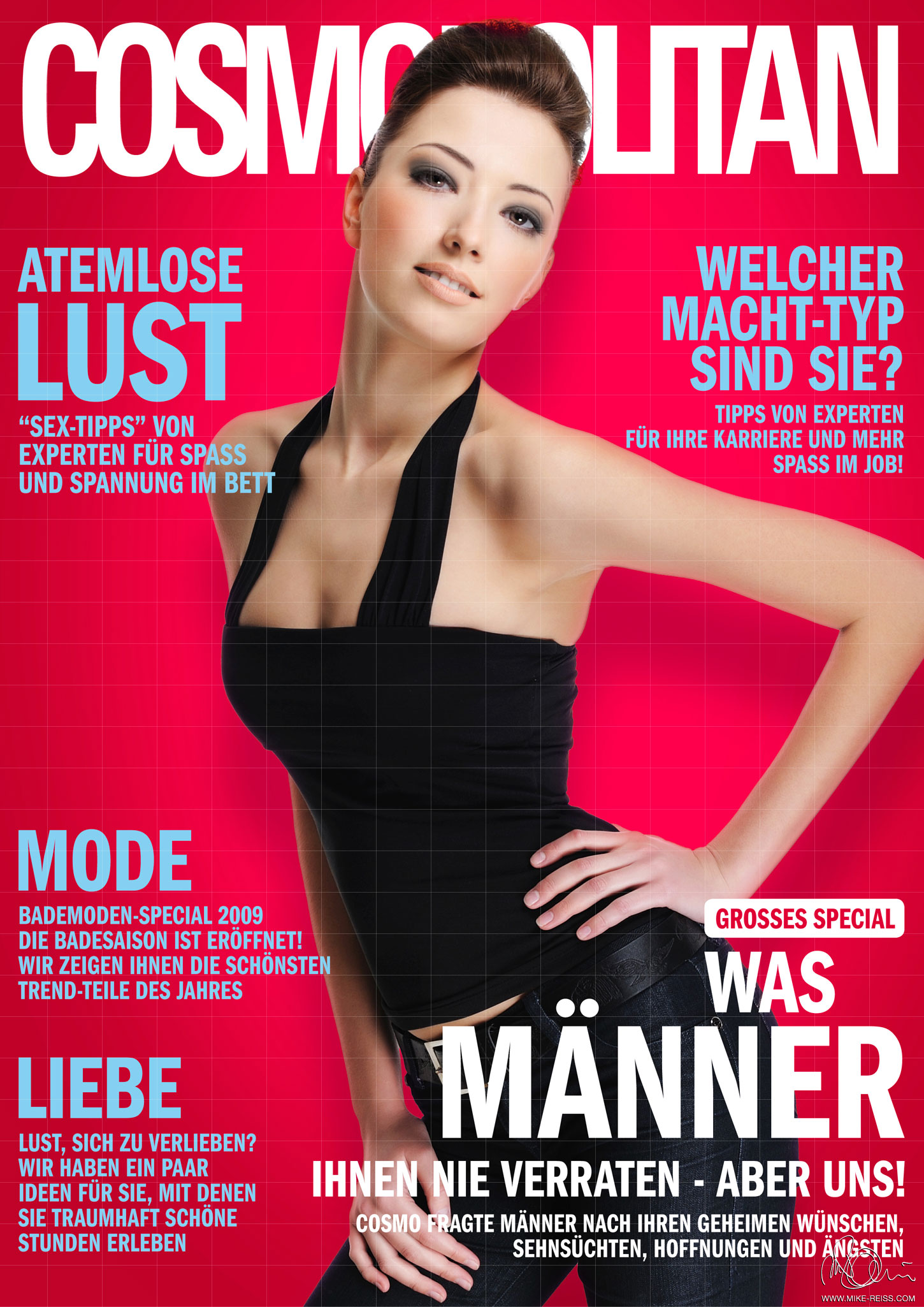
What is a magazine?..


The first thing that comes to my mind is pieces of paper which provides some kind of information depending on what type of target audience it has to represent.

In media terms a magazine is a media text, media product that gives us certain type of information depending on genre, niche market (specific type of people that the product is targeted to), but then the other question which needs to be answered - how do we know what type of genre is certain magazine, what type of audience it is linked to?#

Every media product has its own codes and conventions. Conventions is what the target audience expect to see or hear of that particular type of media text. Mostly every type, or genre magazine has its own ways of representing what is in the magazine. Also genre conventions easily tells us a lot about target audience, even if you (personally) do not belong to it. People stereotype certain things and this lets us understand target audience. Also the magazine itself has some of other media types inside of it, like advertisements, might also have small parts of diaries, stories (interviews) or social media (posts from 'Facebook' included in a paper magazine, to make it more and more modern and to make a target audience much wider. Some people might not like to read a magazine in paper but they would love to read it online. Or maybe some of them likes reading just short stories and they could do it on 'Facebook'.)


For example a magazine with bright colours, mostly pink, light blue and white connotes about female audience. The main image shows the age group of the magazine target audience. Mostly women who read this magazine wants to look like the main image model. Young women from the age of 18 to about 35. 

I have chosen German 'Cosmopolitan' which means I cannot understand the language but media lets me 'read' it from the front cover. 

Model is looking straight into a camera, which is called direct address in media terms. 

The magazine front cover is not overloaded with lots of sell lines or sub stories. It does not have a skyline, any puffs. 
It is quite minimized, but it has the main things like masthead, main image which is not the mid-shot (which connotes us about a genre of magazine, as long as it is a fashion magazine, front cover is already selling clothes, make-up, hairstyle)

Names of sub stories are written in a bigger font to attract attention, also using just one word means it is a very strong word which will catch our target audience eyes straight away. 

Also every magazine has its own USP (unique selling point), usually for fashion magazines it is a model which is used on the main image. This image is the most important thing in magazine, it sells the magazine.


BUT


A magazine not necessarily means a paper magazine. Media goes bigger and bigger every day, now we also have internet magazines. An opportunity to read the magazine online as much as offline just makes the niche market a bit bigger.